
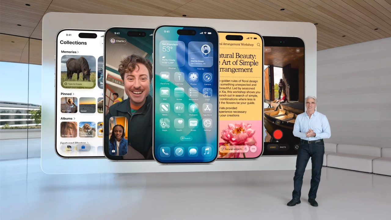
Apple’s recent design language, unveiled through its “Liquid Glass” interface system, has polarized the design community. On the surface, it appears to be another aesthetic iteration: more glass, more blur, more shine. But to evaluate it only as a visual refresh is to misread the real narrative. Apple isn’t merely updating its UI; it’s rewriting the grammar of human-computer interaction.
Behind the transparency and motion lies a radical ambition. The goal is to move from static, screen-bound interfaces to dynamic, context-aware, and multimodal environments. We’re witnessing a quiet revolution, not just in how interfaces look, but in how they behave, adapt, and feel.
The Era of Flat Design Is Closing
Flat design emerged over a decade ago as a counter to skeuomorphism. It championed clarity, simplicity, and performance. By stripping away ornamental elements and focusing on color, iconography, and hierarchy, flat UI design became the default across web and mobile. It served the needs of a maturing digital user base, familiar with digital interactions and less reliant on metaphors.
But flat design had limitations.
It treated screens as fixed canvases. It offered limited feedback loops. It lacked spatiality, depth, and emotion. Most importantly, it was not designed with emerging modalities like AR, spatial computing, or voice-activated systems in mind.
The result? A decade of interfaces that, while usable, often felt inert.
Apple’s “Liquid Glass”: A Shift Toward Spatial Interfaces
With “Liquid Glass,” Apple introduces a spatial, layered, and animated interface paradigm. Surfaces appear to float. Components shift in and out of view based on interaction. There’s a newfound emphasis on translucency, blur, parallax, and motion.
But here’s the key: this isn’t just aesthetic.
These changes reflect a deeper UX ambition:
- Dynamic Visibility: Elements appear only when contextually needed, reducing visual clutter and emphasizing focus.
- Spatial Hierarchy: UI components now communicate importance not just via color or size, but through depth and positioning.
- Motion as Feedback: Microinteractions and transitions are designed to express causality and continuity, key principles in cognitive affordance.
- Ephemeral UI: Components are no longer fixed. They exist as ephemeral layers, ready to emerge and recede, mimicking the way we expect tools to behave in the physical world.
This is Apple laying the foundation for post-screen UX. A design system built for wearables, AR glasses, ambient environments, and AI-driven interactions.
The UX Community’s Concerns, and Why They Matter
Still, the pushback has been loud and not without merit. UX practitioners, accessibility advocates, and users have pointed out real usability challenges in the current implementation.
1. Reduced Legibility and Contrast Violations
The excessive use of transparency and background blur often compromises readability, especially in layered contexts. Designers note failures in contrast ratios, violating WCAG accessibility guidelines and alienating users with low vision or color sensitivity.
When decorative effects begin to interfere with core content delivery, we enter dangerous territory. The principle of content-first design gets replaced by style-first decisions.
2. Increased Cognitive Load
Motion and animation, when overused or non-essential, add cognitive overhead. Users are forced to track elements spatially or wait for transitions that don’t serve functional purposes. This violates the Hick-Hyman Law, which emphasizes minimizing the time users need to make decisions.
Rather than reducing effort, such effects create friction, especially for neurodiverse users or those navigating under stress.
3. Poor Discoverability and Learnability
By making UI elements ephemeral and context-triggered, the system introduces invisible complexity. Users may not know where to find a function if it only appears under certain conditions. This undermines the principle of predictability, one of the cornerstones of good UX design.
We trade static clarity for dynamic ambiguity. And without clear mental models, usability suffers.
4. Accessibility as an Afterthought
While Apple provides toggles like “Reduce Transparency,” this feels like a bolt-on fix. Accessibility should be embedded in the design process, not addressed in settings menus. According to inclusive design frameworks, adaptability should never come at the cost of usability for any group.
Why It Still Matters: A Glimpse of the UX Future
Despite these valid criticisms, Liquid Glass matters. It signals Apple’s long game. The company is designing for context-aware, spatial, multimodal ecosystems, not just flat screens. Think of the Vision Pro, spatial audio, dynamic island, or Apple Intelligence. The interface is no longer a 2D surface. It’s an ambient system.
This is the beginning of ambient UX. A future where:
- Interfaces respond to presence, gestures, and voice
- Visual elements adapt to environmental lighting, distance, or device form factor
- Feedback isn’t only visual, but spatial, haptic, and auditory
- UI becomes behavior, not layout
The Role of UX Designers Now
Designers must now prepare for the post-flat era. This requires rethinking long-held heuristics and embracing a more fluid, systems-based approach to interaction.
- Move beyond grid-based layouts to responsive component behaviors
- Design for motion and depth as functional UX tools, not decorative ones
- Prioritize progressive disclosure, where the interface reveals complexity only when needed
- Prototype with temporal and spatial transitions, using tools that simulate layered environments
- Re-center accessibility and contrast as first principles, not edge cases
Designing for Presence, Not Just Placement
As we shift away from static screens and toward fluid, immersive interfaces, UX design must evolve beyond the rigid boundaries of layout and position. The goal is no longer to simply place components where users expect them—but to create systems that sense presence, respond intelligently, and adapt fluidly to context.
This is where Apple’s new UI direction becomes significant. Despite criticism around visual distractions or readability due to transparency, it signals a foundational shift: interfaces that behave like environments, not just look like them. The visual language—liquidity, translucency, motion—isn’t superficial. It’s part of a deeper move toward dynamic spatial interaction, where content and controls appear when needed, recede when not, and integrate naturally into the user’s flow.
For UX professionals, this challenges long-held conventions. It requires us to think in terms of choreography, not just composition. About affordances that are felt, not just seen. It means crafting experiences that feel alive—where the interface becomes an intelligent, ambient layer in people’s digital lives.
We’re no longer designing screens. We’re designing presence.
Let’s talk. How do you see the future of UX in a world of spatial, multimodal design? Is Apple leading a real shift, or simply testing the limits of aesthetic over function?